01
As part of my growth as a product designer, I chose to redesign Pinterest’s mobile onboarding flow. The goal was to audit the current experience, identify usability and emotional friction points, and propose a fresh, visually aligned onboarding experience that balances clarity, accessibility, and personalization.
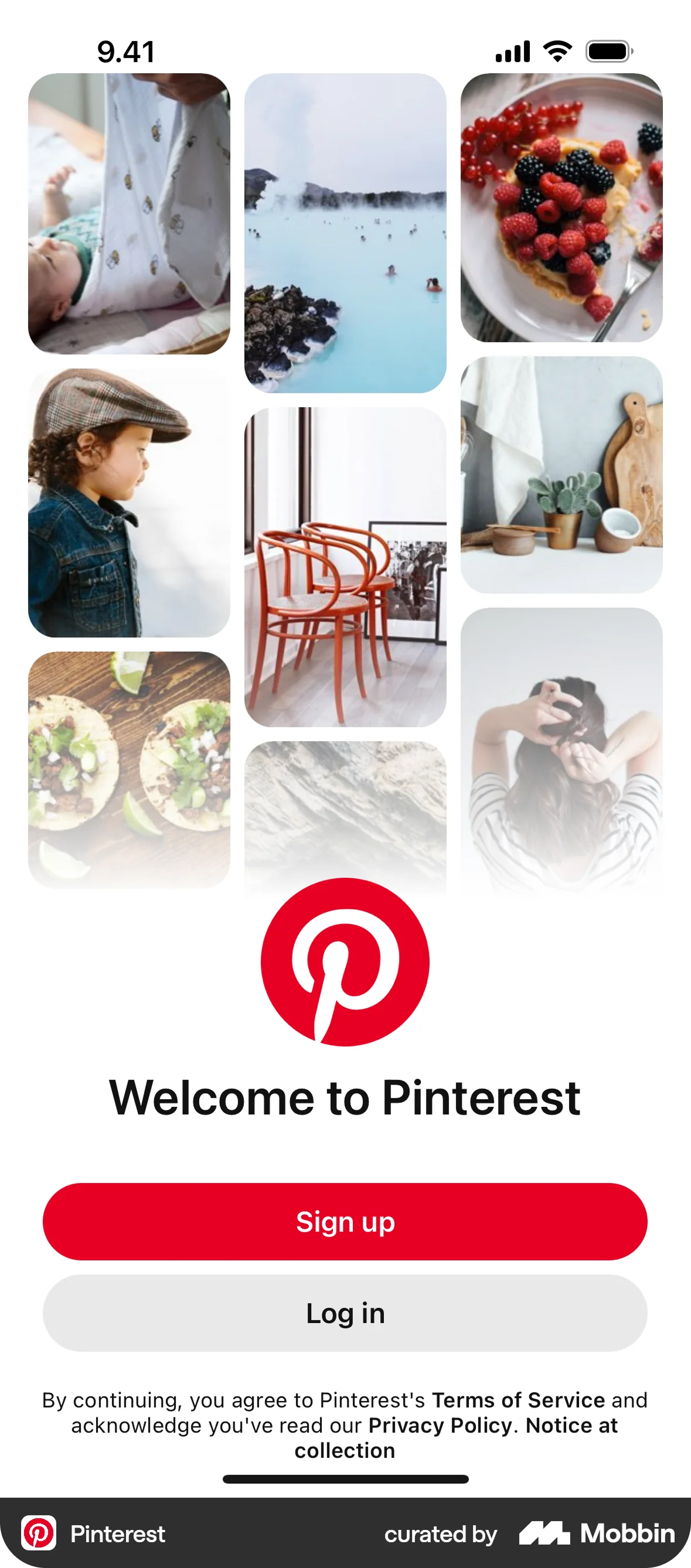
Pinterest’s current onboarding is functional but lacks aesthetic warmth and personalization, which can create friction for creative users.
Improve the onboarding to feel more editorial, personalized, and inspiring — like the product itself.
02
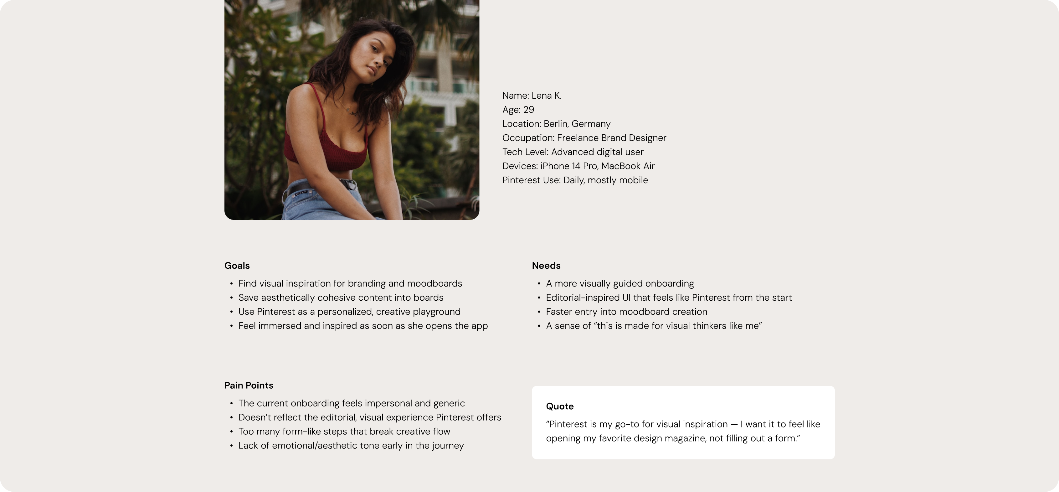
To better understand the needs and motivations behind the redesign, I created a user persona based on Pinterest’s core creative audience.
03
04
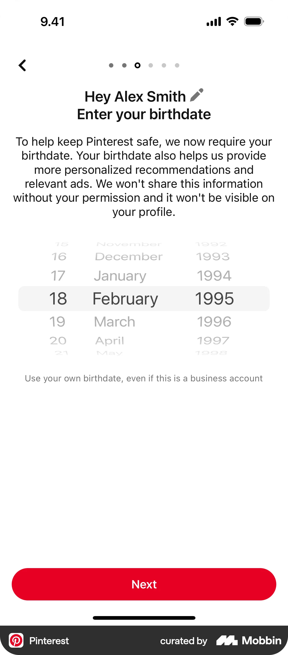
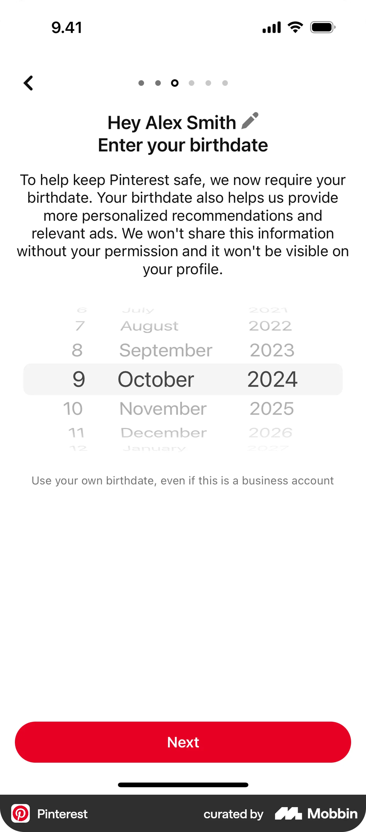
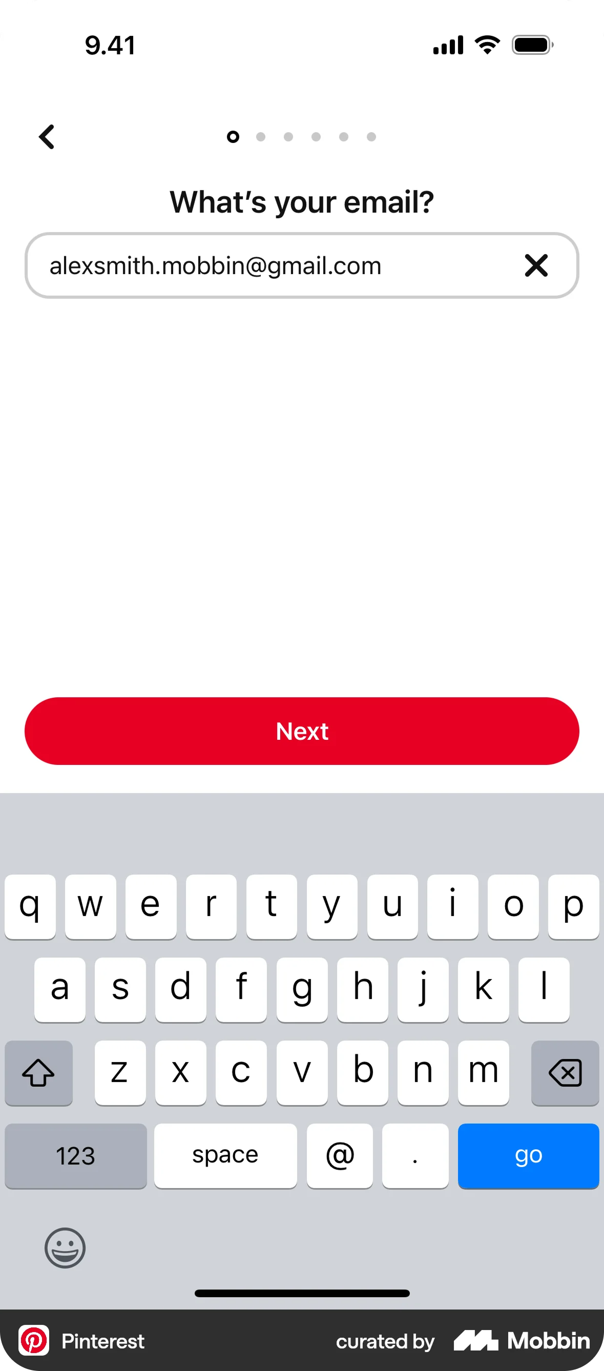
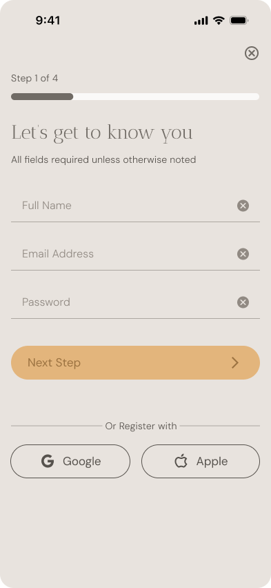
Replace the default, form-like steps with a more conversational tone and human-centered copy. The user should feel spoken to — not processed.
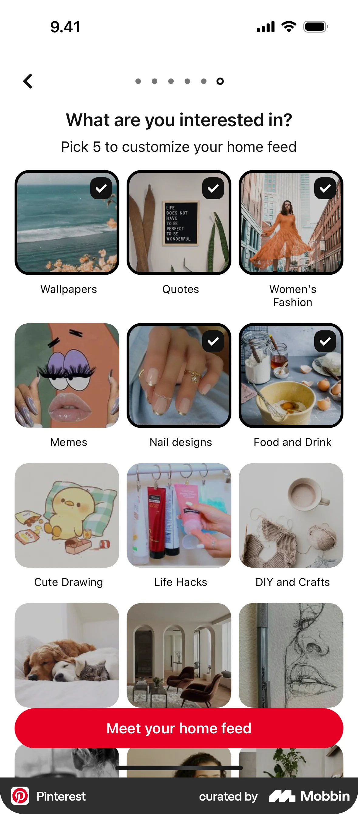
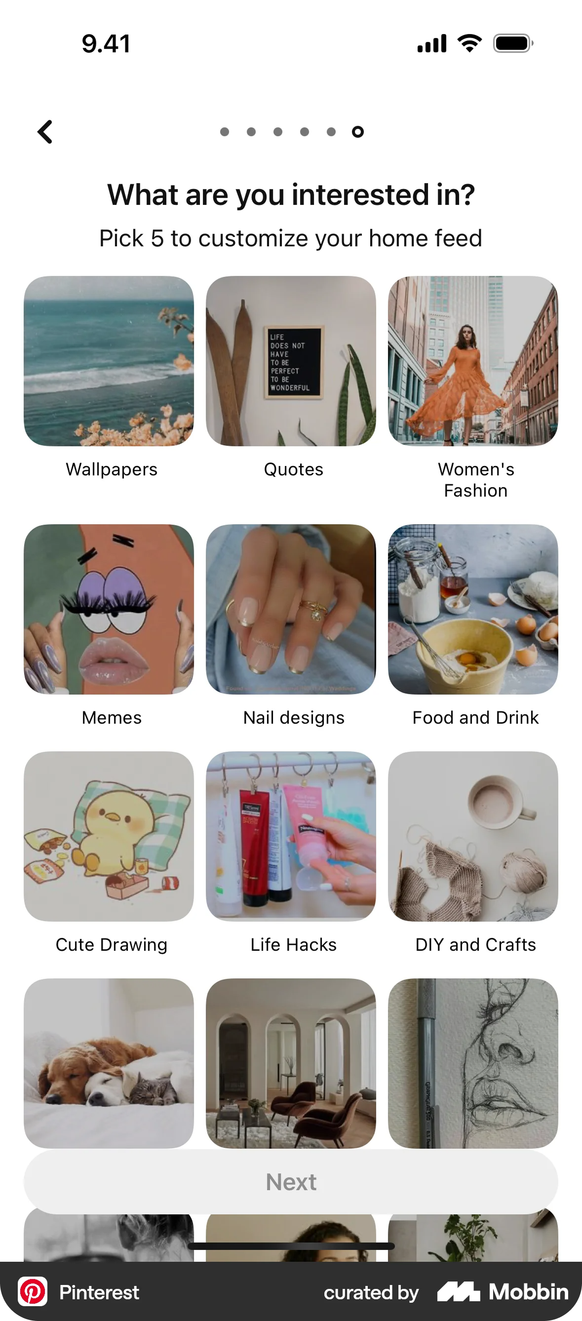
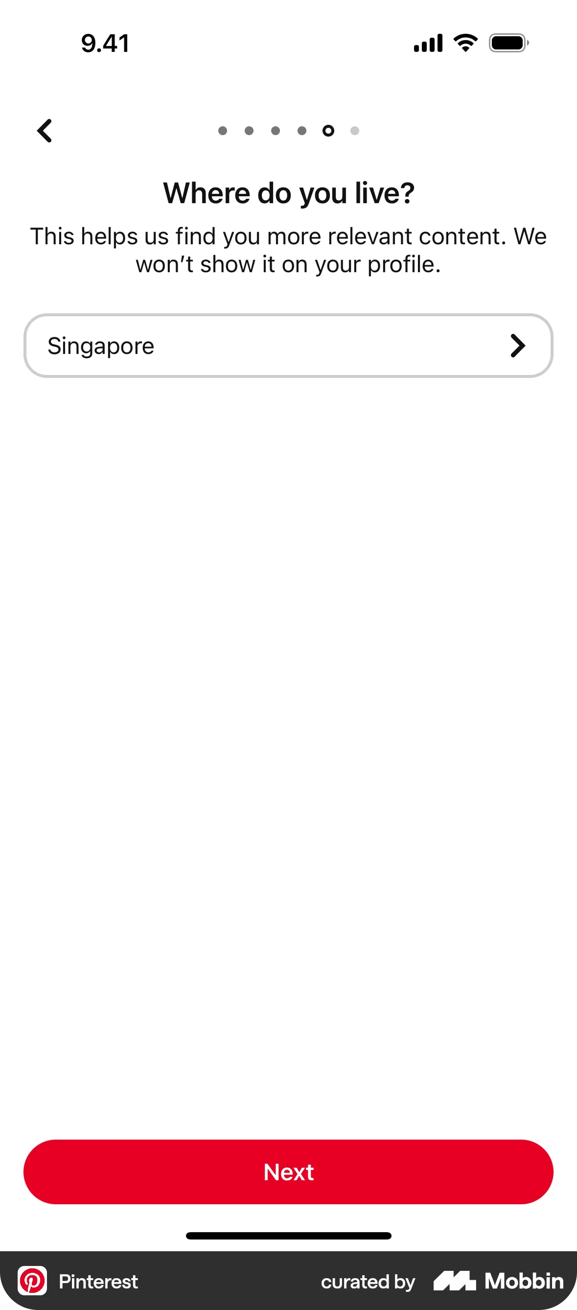
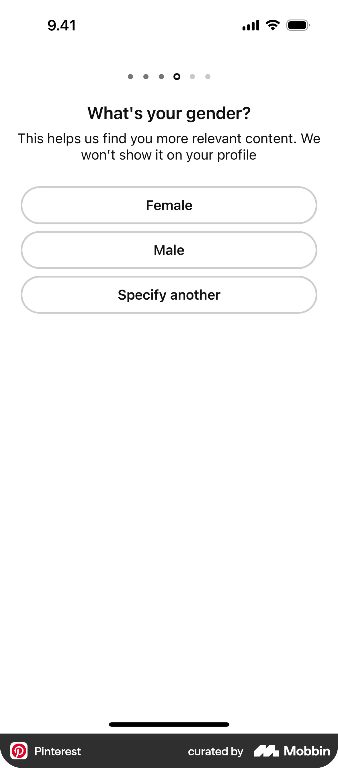
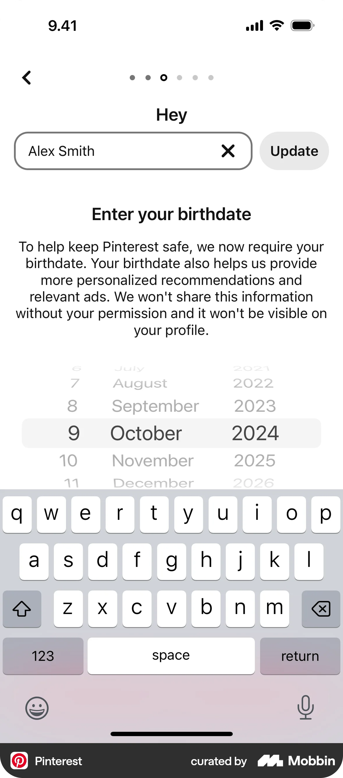
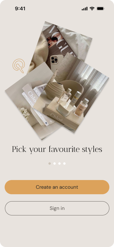
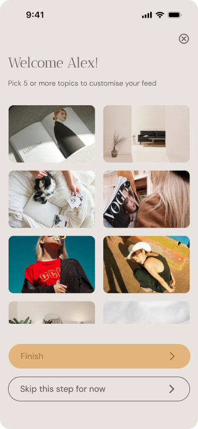
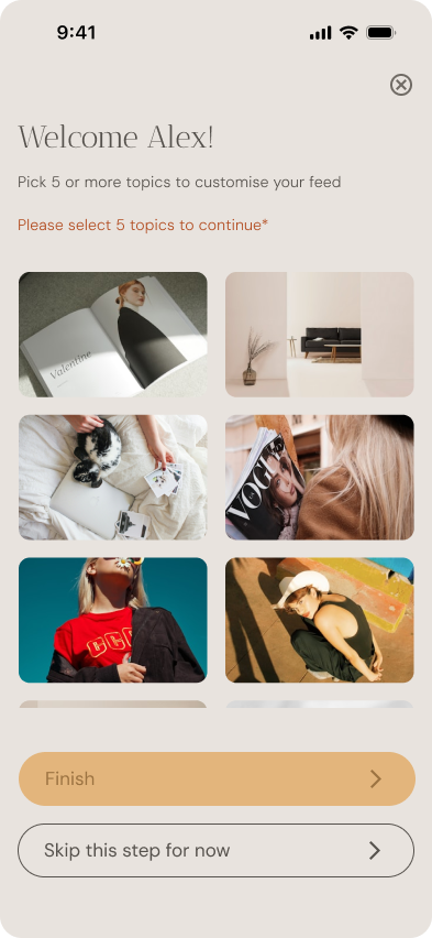
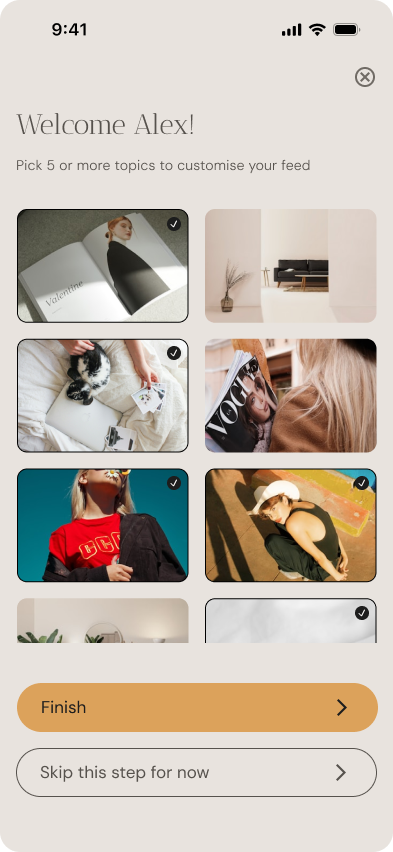
Pinterest is a platform built on visual inspiration. The onboarding should reflect that from the very first screen, using imagery and space creatively.
Avoid overwhelming the user with forms, but don’t remove structure. Inputs are grouped smartly to balance efficiency and clarity.
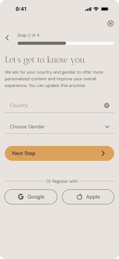
Help users understand why we ask for certain information (like gender or country), and give them reassurance through friendly microcopy.
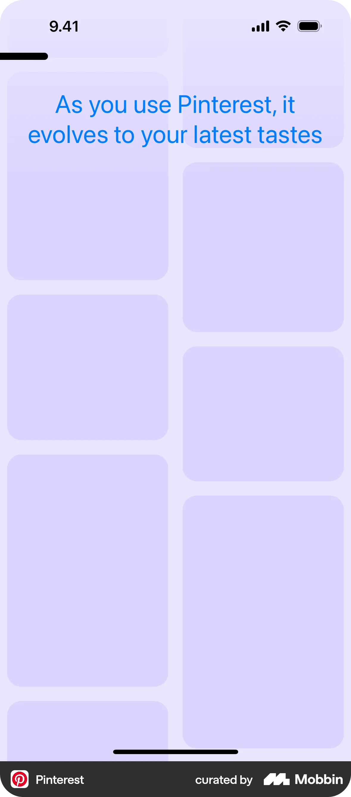
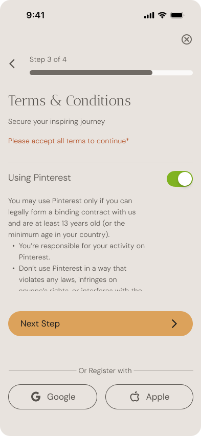
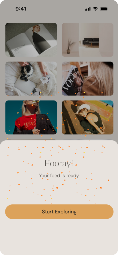
The last steps should feel exciting and visually aligned with the actual Pinterest feed. Avoid dead ends or emotionless screens like “All set”.
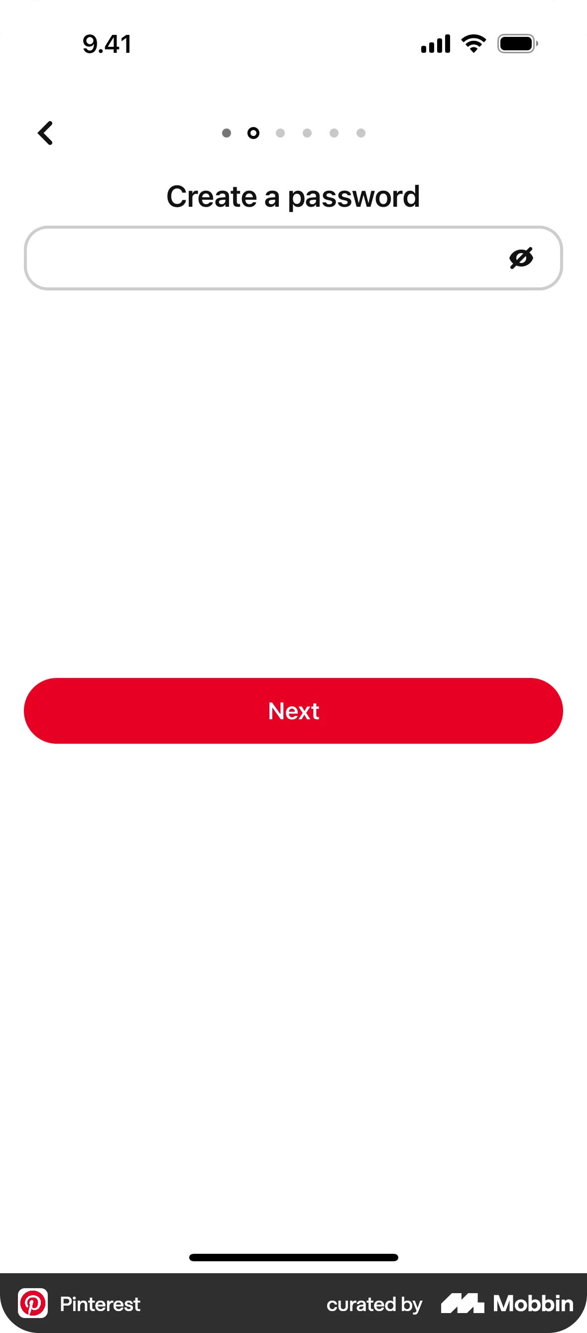
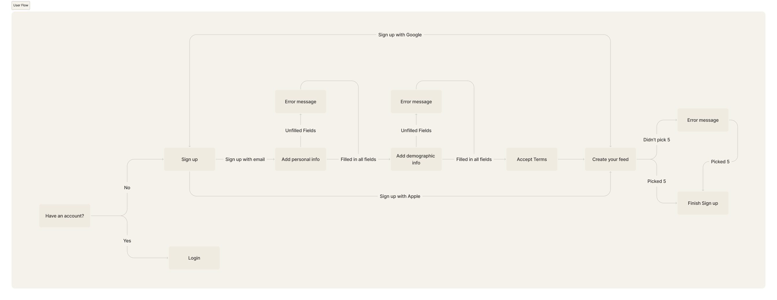
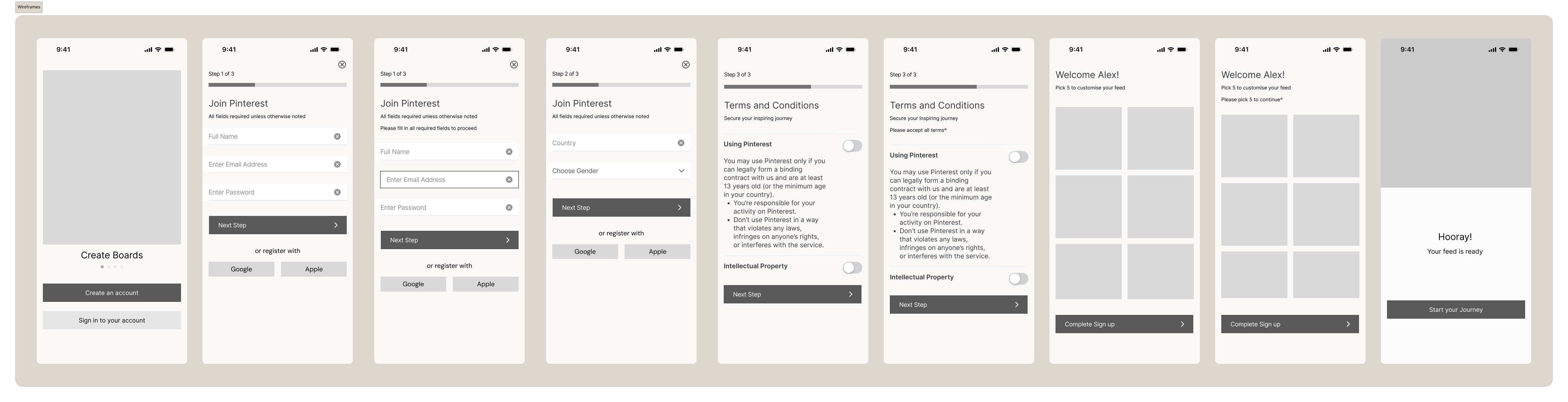
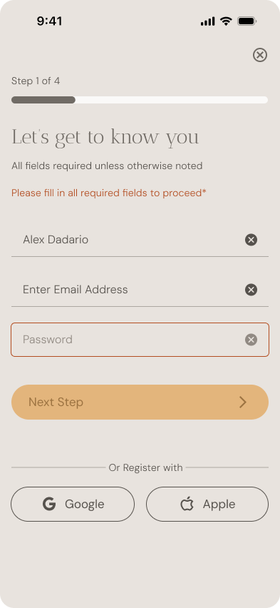
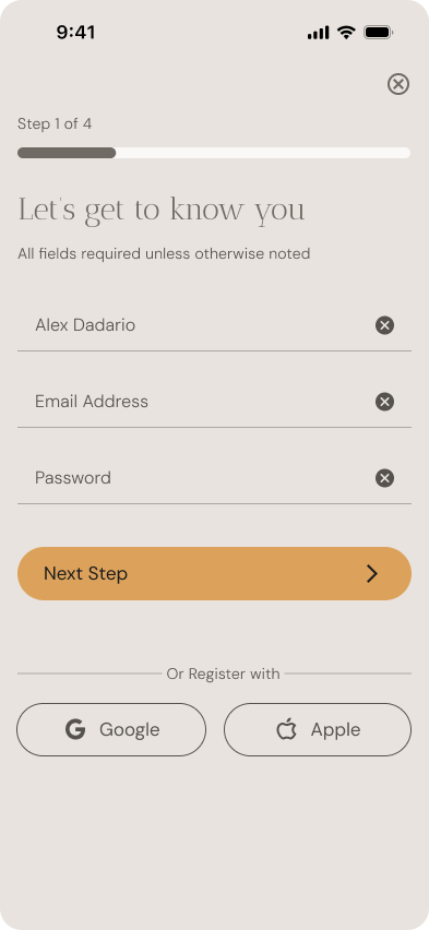
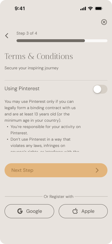
In the redesigned Pinterest onboarding, I restructured the flow to feel more intentional, visually engaging, and emotionally aligned with how creative users think. Rather than splitting every input into its own screen, I grouped steps meaningfully to reduce friction while maintaining clarity.
06
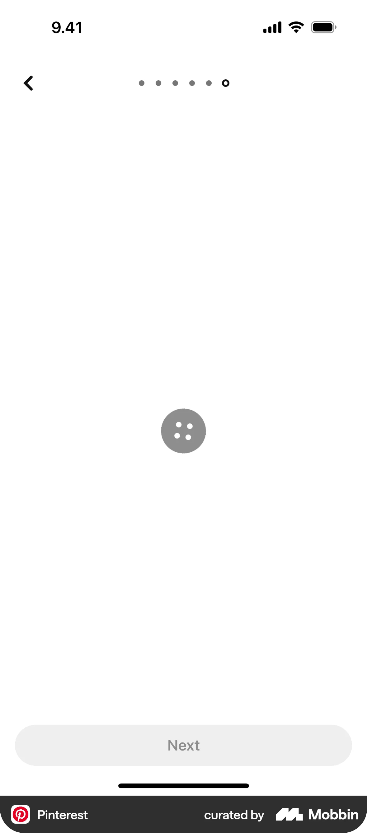
I created wireframes to visualize the new layout and prioritize key information on each page.
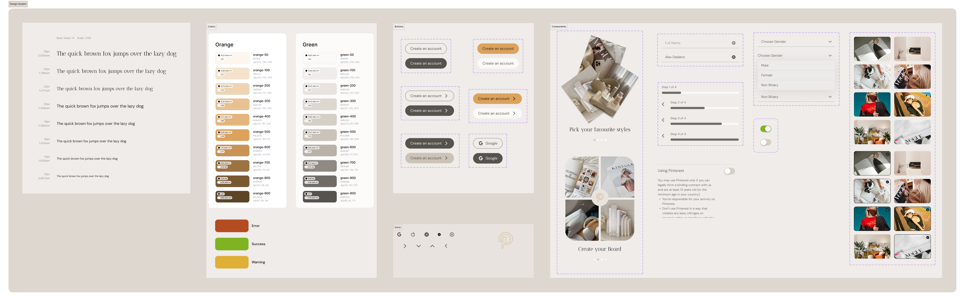
For the UI, I aimed to translate Pinterest’s visual-first brand into an onboarding experience that feels editorial, soft, and focused. The design system I created uses a neutral background, spacious layouts, and a clear visual hierarchy that allows key elements to stand out without overwhelming the user.
06
07
08
This project gave me the space to connect product thinking with visual storytelling. By redesigning a flow as familiar as Pinterest's onboarding, I was challenged to think critically about what makes an experience feel intuitive, human, and on-brand — beyond just clean screens. One of the key takeaways was the importance of structure: how grouping inputs, shaping copy, and layering visuals can guide users not just functionally, but emotionally. I also deepened my understanding of how to build and apply a UI system consistently across screens, while remaining flexible enough to handle edge cases.