01
Locate Cyclades is a villa booking platform based in Paros, Greece, targeting travelers seeking luxury stays on the island. The original website had several usability issues that blocked users from successfully finding and booking villas. My challenge was to redesign the experience in a way that reflects the brand’s premium island identity while fixing critical UX flaws that caused drop-offs in the booking journey.
As the UX researcher, UX designer, and project manager, I was responsible for:
02
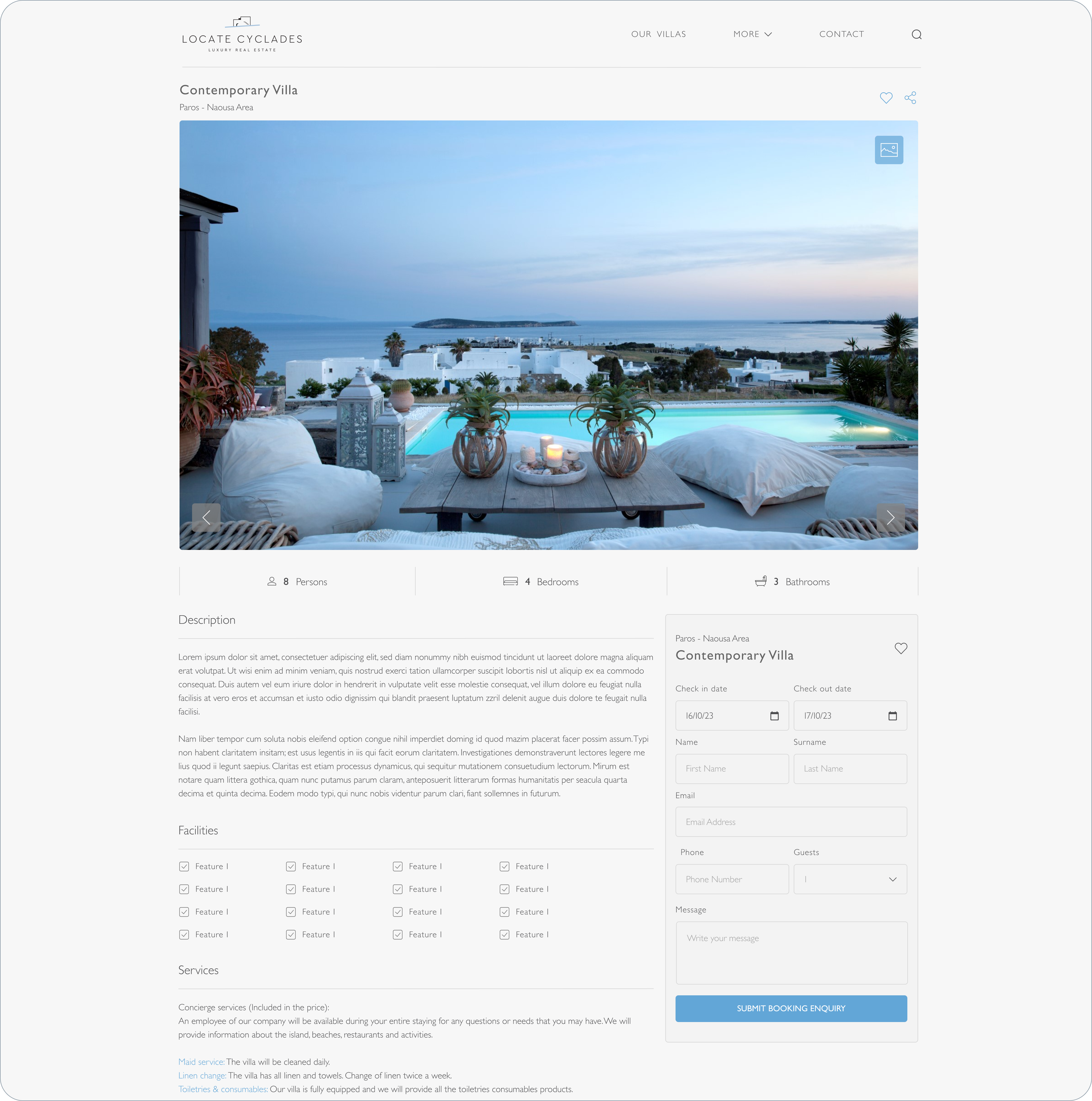
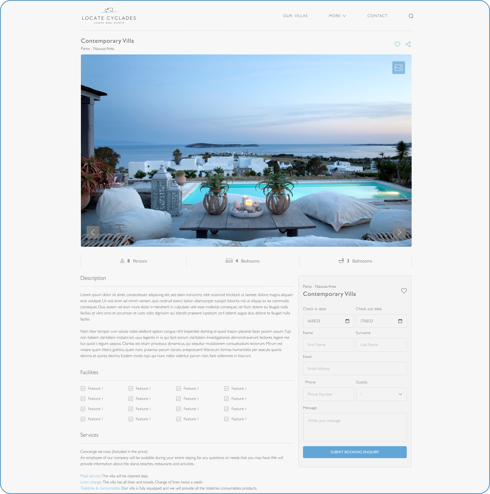
Desktop - Villa page
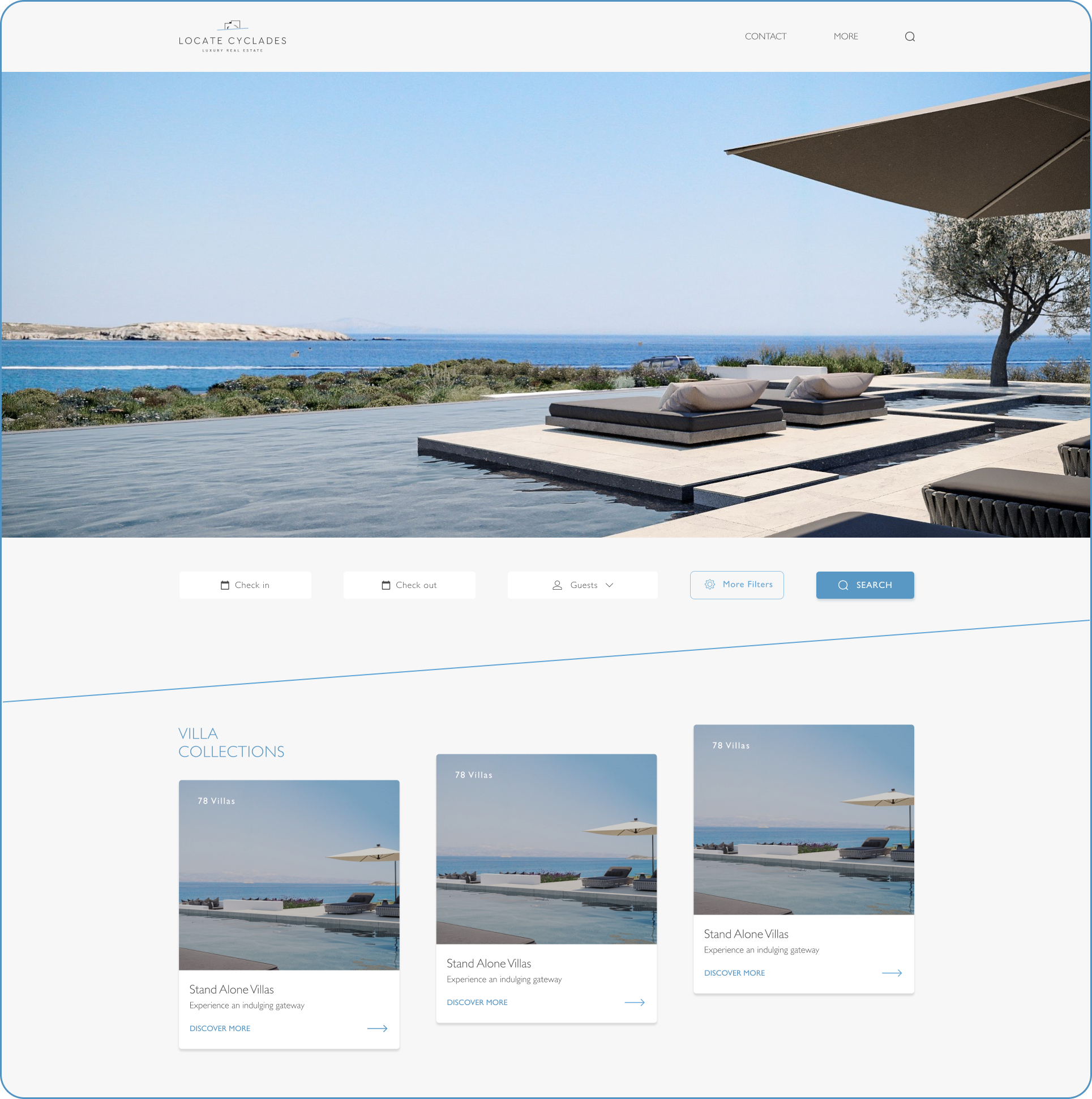
Desktop - Homepage
04
Based on the research findings, I developed targeted solutions to enhance the user experience and improve conversion rates.
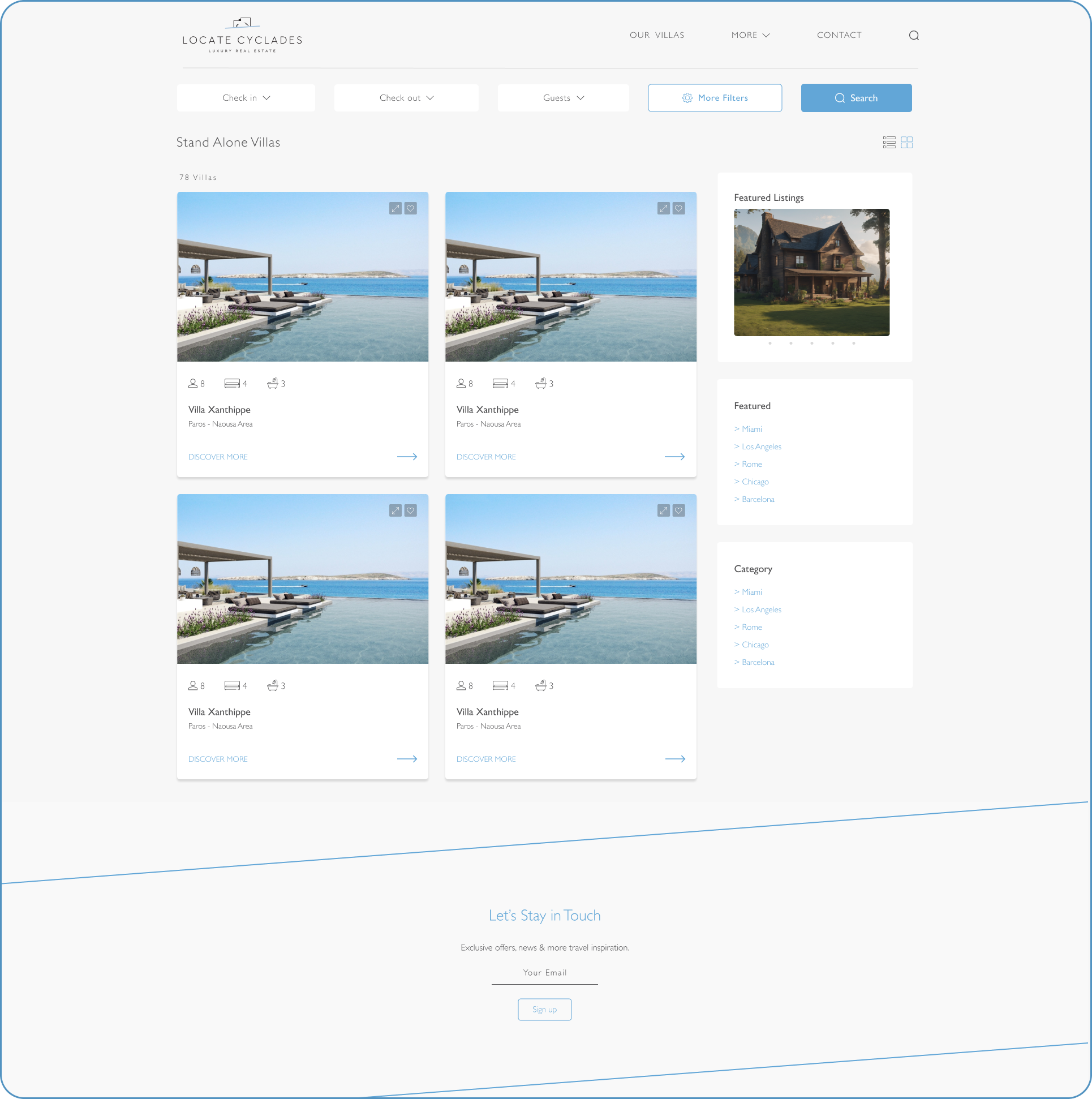
Problem: The search form lacked essential filters, making it difficult for users to refine their search.
Solution:
Problem:
Users browsing the villa rental detail page were experiencing
friction when trying to initiate a booking. There was no booking
form available on the page, which forced users to leave the site
or navigate elsewhere to proceed with a reservation. This lack of
a clear call-to-action created confusion, interrupted the user journey,
and resulted in missed booking opportunities.
Solution:
To streamline the booking process and reduce user effort,
I introduced a sticky booking form that remains visible as users
scroll through the villa’s details. This ensured that the booking
CTA was always accessible, provided a clear next step, and significantly
increased user engagement — resulting in a smoother experience and
improved conversion potential.
Problem:
Users visiting the villa detail page expected to see a gallery with
multiple images but were limited to a single photo. This created hesitation,
as they couldn’t fully explore the property. At the same time, the client
wanted key information to be immediately visible without requiring users to scroll.
Solution:
To meet both user and client needs,
I implemented a layout featuring
an image slider that showcases multiple photos of the
villa. Around the slider, I placed the most essential
information (e.g. title, location, price, capacity)
to ensure everything important is accessible at a glance —
enhancing both usability and visual engagement.
05
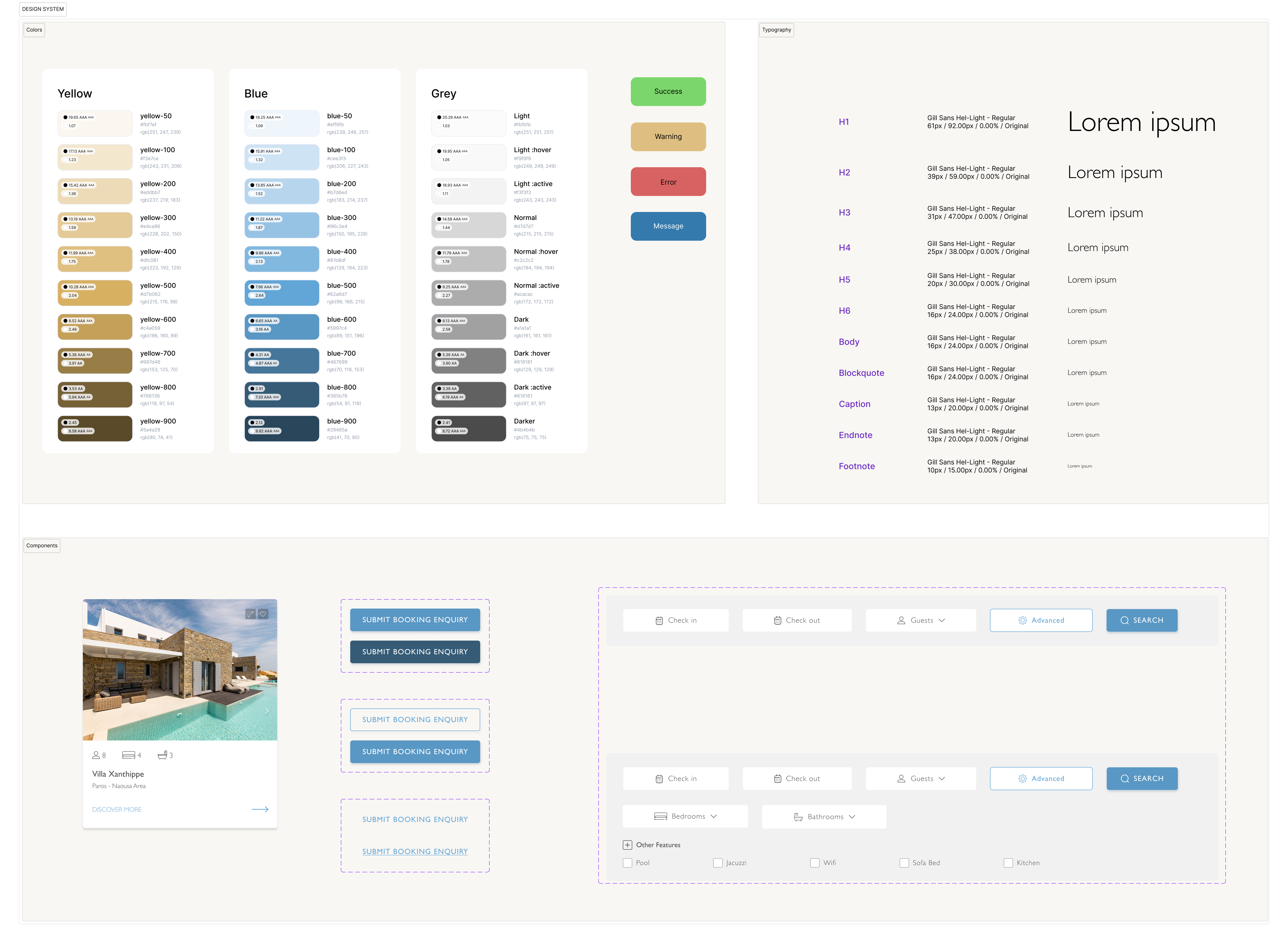
The design follows a light, minimal aesthetic with Mediterranean-inspired colors that reflect the essence of Paros. The palette and layout aim to convey a sense of calm, warmth, and effortless island elegance.
06
07
The client expressed satisfaction with the redesigned structure and visual direction, already noticing smoother user flows and an increase in bookings. They also requested a few visual enhancements, such as additional spa imagery and greater emphasis on local experiences.
We tested the high-fidelity prototype with a small group of users to ensure they could easily navigate the new layout, find relevant villas, and complete bookings without friction.
The website launched shortly before the summer season, and early indicators are promising — with improved engagement and more booking requests. However, we plan to conduct a full analysis of heatmaps and analytics after the peak season ends, to evaluate long-term performance and identify further optimization opportunities.